Menu
New Site! and Browsers
I have a new site! It's not perfect, but it's something I feel better about than the previous iteration.
Generating the site
Despite being the part I spent the largest chunk of time on, I don't have much to say on the scripts that assemble this site together. I was interested in learning Perl and found the idea of using an existing solution boring, so I made my own.
I would not advise you use this for your own site[1], but if you want to check out the source, it's available here.
Professional...ness
For years I've been plagued by a need to be "professional" with the things I create online. This, in my mind, translates to an almost sterile expression—anything outside of absolute plain-text or some Twitter Bootstrap-y design is too far.
However, any site I make that ends up so barren will just cause me to lose any motivation to work with it. So, I'm trying something new! I'm hoping to hit an early-to-mid '00s style with this, with some extra handling for more modern devices. I don't feel it's really that far out of the norm anyway, but it's the little things that count, right?
Checking off "moral justification for
putting all content into a single <table>"...
That said, making a more complex design means having to worry about how browser rendering engines work. That is, they work like a tower of bricks liable to topple if one of your hyperlinks sneezes the wrong way.
Browser engines
For better or worse, the browser landscape is pretty boring these days. Responsive design is more important with screens taking a myriad of forms, from touch-screen phones to 8K 50-inch televisions. Despite the variety, there are usually a few key assumptions you can make.
With over 65% market share as of time of writing[2]—not even including the browsers using the same underlying renderer—Google Chrome and its Blink engine are going to be the most common you'll see. Of course there may be some small differences depending on the OS, but most if not all of the features are consistent. And especially if you stick to standards or keep an eye on sites like MDN and caniuse.com, supporting non-Blink browsers like Firefox and Safari won't be much of a problem.
But those aren't the only browsers still updated these days! Text-mode browsers like lynx, derivatives like Pale Moon and SeaMonkey, and built-from-scratch GUI browsers like NetSurf are all used by a multitude of people today. Not all these browsers are going to support modern JavaScript, features like custom fonts, or even graphical elements like images. This brings a lot of challenges, not all of which are neatly solved.
Just trying to support modern browsers, you might have to employ kludges to get things to look as you hope. For example, say someone converts an old bitmap font to a pixellated TTF format so you can further have that 2000s web design aesthetic for your site. You've taken a crowbar to the anti-aliasing algorithm of every browser as much as you can (much to the frustration of other web designers), and things are looking pretty crisp. Then you get a message or five from others saying the font looks broken. It's blurry, or it's stretched in weird ways.
You're able to deduce the issue as being a rendering issue if the text is aligned on a half-pixel[3]. This weird quirk might be happening because of how you center your content in the browser. Maybe something like:
    width: 500px;
    position: absolute;
    left: -250px;
    margin-left: 50%;
So with a viewport size of 1920x960, (1920 * 0.5) - 250 = 710px and
everybody's happy. But resize your window to 1919x960 and you get
709.5px, causing the font renderer to become evil.[citation needed]
So you might end up with this garbage, just to get the centering to round to the nearest pixel:
function fixMargin() {
    document.getElementById("main").style.marginLeft =
        Math.floor(window.innerWidth / 2).toString() + "px";
}
window.addEventListener('resize', fixMargin, true);
window.addEventListener('DOMContentLoaded', fixMargin, true);
But it works! Most of the time. And also only if your browser supports JavaScript, but what browser wouldn't support JavaScript in 2022?
NetSurf
I have strong and complex opinions about JavaScript. They're nothing that hasn't been discussed to death, but I'd prefer to avoid JavaScript when possible and make sure that a curious user knows why I'm running code on their computer.
Even so, it'd be bad to assume my JavaScript will run at all.
NetSurf is a small, fast web browser that supports HTML5 and CSS 2.1 in varying capacities, and has some preliminary support for JavaScript. That said, support for JavaScript is disabled by default, and support for other technologies is a bit complicated.
I only started working on NetSurf support after a partner noted an older version of the site's design looked broken in the browser. The content was readable and most of the functionality worked fine, but it wasn't very pretty. And that just won't do.
First off was dealing with the CSS. Chrome, Safari, and Firefox support
multiple background-images in succession, and show them right next to
each other. Something like:
background-image: url(img/left.png), url(img/right.png);
background-position: top left, top left;
background-repeat: no-repeat, repeat-x;
NetSurf refuses to even process any images if it sees them in a list
format like that. NetSurf also doesn't support z-index yet, so I had
to be careful about how I designed elements that'd be in "layers," like
the snowflake in the site background.
One hack I'm proud of is how I handle the "subtitle" seen on the index page. In browsers with JavaScript enabled, you only see one of the (currently) three subtitles, and can get another one by clicking on it:

If you're on a browser that doesn't support JS or has it disabled though, you should see the full list, like so:

This is accomplished by the use of a <noscript/> tag. If you have
something like:
    <noscript>
      <p>
        Hello, world!
        <a href="http://example.com">Click here.</a>
      </p>
    </noscript>
A browser with JavaScript will hide the element, and a browser without
JavaScript will show the element. Except it's not quite as simple as
setting display: none; on the tag. The browser with JavaScript won't
even attempt to process the HTML within the tag.
So the script that handles the rotation of the subtitles grabs the
<noscript/> element, passes that to a DOMParser object, and uses
that to grab the DOM elements it needs.
After a lot of tweaking and frustration, I had something that looked mostly similar between all the browsers I was testing. There are still some small differences (for example, NetSurf doesn't seem to support custom fonts yet), but it was enough for me to sleep peacefully at night.
And then I came up with an absolutely awful idea.
Anyway, Here's Netscape
I got together a Windows 98 SE virtual machine with QEMU, connected it to the Internet like your parents said you should never do, and installed Netscape 7.2. Surprisingly, the dev site was in pretty good shape. Probably the work put into NetSurf support paid off.
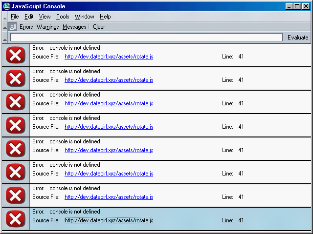
The most notable issue was that the subtitle wasn't appearing at all. Attempts to troubleshoot with Netscape's JavaScript console made me appreciate Firefox's modern console a bit more.

The majority of the errors were, as one might guess, features that just
didn't exist when Netscape 7 was created. As shown above, no console
object exists in Netscape for console.log() calls to log to the
console. This also kills the script, which makes sense but is also
annoying.
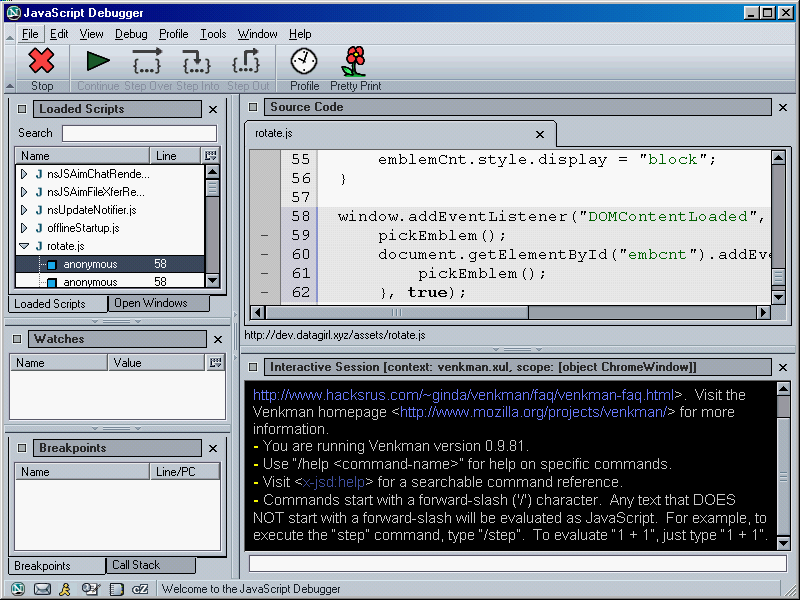
The JavaScript debugger bundled with Netscape, named Venkman, is surprisingly nice for the time. From my experiences as a kid messing around with Frontpage and Internet Explorer 6 or so, I was dreading it. To the contrary, it almost felt like a proper IDE. I can definitely feel where pieces of this ended up becoming the modern Firefox developer tools.

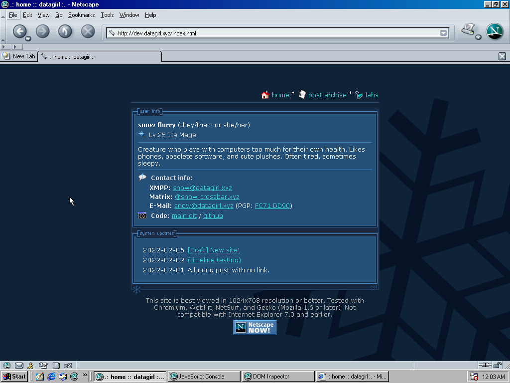
And without further ado, here's a full screenshot of the site in Netscape 7.2:
It's got some issues with colors, but I'm happy with it.
And in case you're curious, here's how it looks on Internet Explorer 5 on the same VM:
I will not be fixing this in the near future, mainly because debugging Internet Explorer is annoying and I don't even know where to begin with whatever's happening here. Maybe someday I'll revisit it.
Moving forward
This site is still far from complete, so things will change over time. Maybe I'll spontaneously find motivation to get the site presenting properly in Dillo! Probably not.
Honestly, the Netscape support was an "extra credit" exercise. I sought to support NetSurf because multiple loved ones use it, and I'm at least pretty confident that if my site can work in Netscape 7.x, it'll work in later Gecko forks like Pale Moon.
Also, I hate working with mobile browsers and will put off things I dread until the last second. But I'm sure that's got nothing to do with it.
- If you're looking for a static site generator, I haven't worked with Jekyll personally but I've heard good things about it.

- Using StatCounter for statistics here. I imagine all of the stat sites are ballpark estimates at best.

- Don't worry, I barely understand what I'm talking about either.

Site by snow flurry, 2022-2025. Writing and code snippets are licensed under CC BY-NC 4.0, except where noted.
Best viewed in 1024x768 resolution or better. Tested with Chromium, WebKit, NetSurf, and Gecko (Mozilla 1.6/Netscape 7.0 or later).
Site by snow flurry. Writing CC BY-NC 4.0 except where noted.


